LearnEmty

UX Design
Screenshot of the prototype created for the project LearnEmty, showcasing various pages and how are they connected.
My Rol
Alexia Vidal - UX designer leading the app and responsive website design from conception to delivery
Project type
UX Design
Project year
August 2024-September 2024

The product: 

LearnEmty is a fictional international organization focused in helping children of all ages to communicate, understand and manage their emotions, while also learn the importance of empathy. They want to accomplish all that using games, videos and stories appealing to kids, while the parents or tutors can do a follow up of the work.

The problem: 

Kids often don’t know how to express how or what they’re feeling and how to manage all their emotions, they may feel overwhelmed with all.

The goal: 

Give kids the tools to learn how to express, communicate and manage what are they feeling in a fun way.

Right arrow

Objective Users

Persona 1: Sophie

Problem statement:

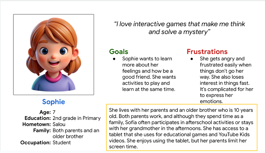
Sophie is a curious 7 y.o. Girls who need an interactive and attractive tool for children that helps identify, understand and manage their emotions because as a kids faces challenges to understand and communicate correctly their emotions.

Pesona created for the project named Sophie, it contains all info, goals, frustrations, etc.

Persona 2: Daniel

Problem statement:

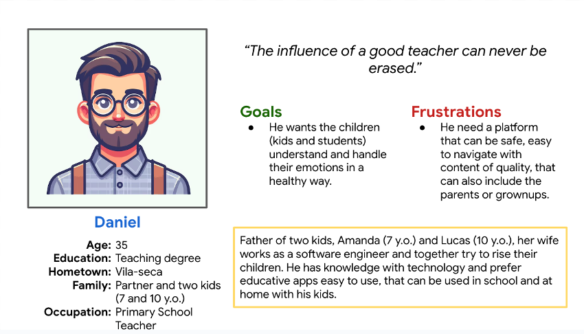
Daniel is a parent and primary school teacher who needs a way to help kids express their emotions in a better way because he wants to help them to have healthy relationships.

Pesona created for the project named Daniel, it contains all info, goals, frustrations, etc.

Results of the Usability Test

  • Study type: Unmoderated usability study
  • Participants: 5 participants
  • Location: Spain, remote
  • Length: 30-45 minutes

Findings

These were the main findings uncovered by the usability study: 

  1. Users need a more intuitive way to filtrate the content, especially the young ones.
  2. More visual instructions on how the app works.
  3. Add visual representation on the progress made.

Accessibility considerations

  1. Clear labels for interactive elements that can be read by screen readers.
  2. Insert tags to the content to make easier identify the topic in each one.
  3. Make sure the colors used are not confusing for people with visual impairments.

Initial Designs

Sitemap

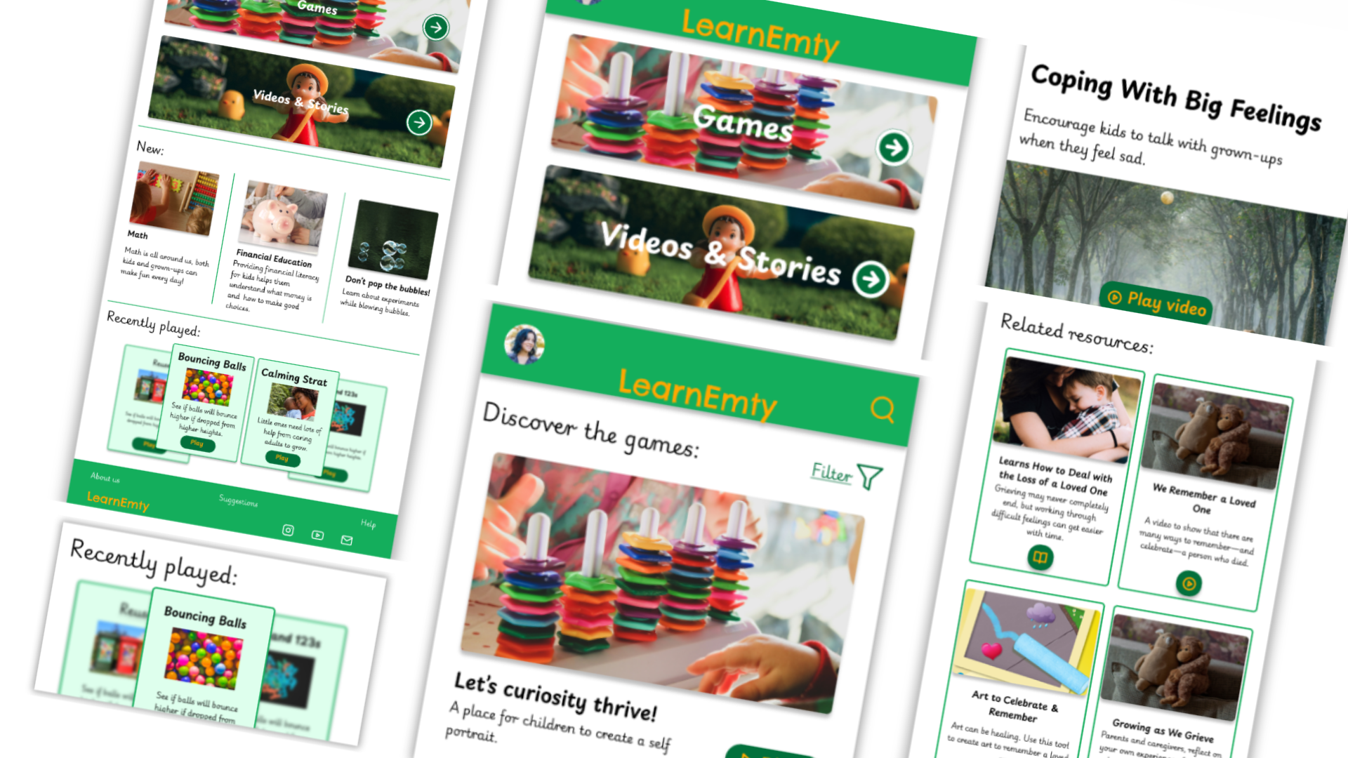
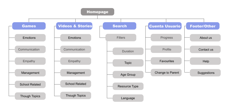
With the app designs completed, I started work on designing the responsive website. I used the competitors sitemap to guide the organizational structure of each screen’s design to ensure a cohesive and consistent experience across devices.

Sitemap for the app

Paper Wireframes:

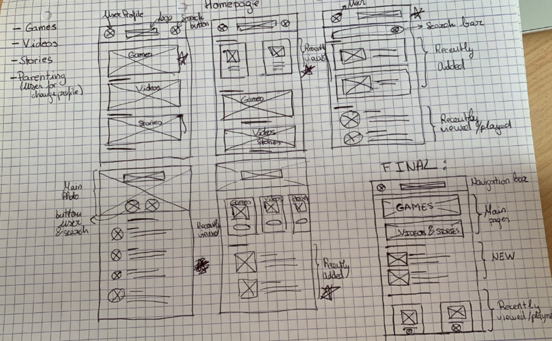
I did a quick ideation exercise to come up with ideas for how to address gaps identified in the competitive audit. My focus was specifically on how to make attractive and interactive for the kids

First paper wireframes made, and the final combination.

Digital wireframes 

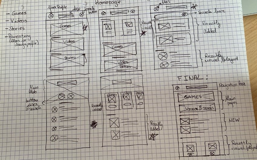
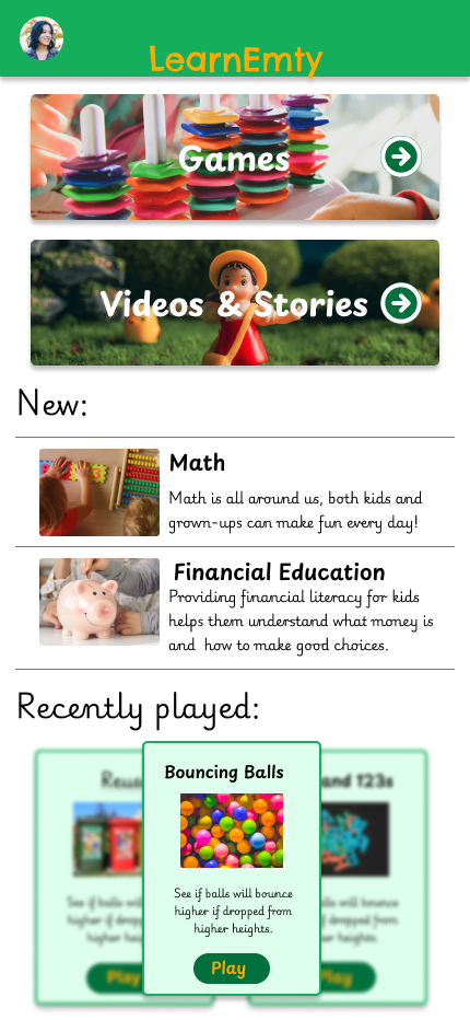
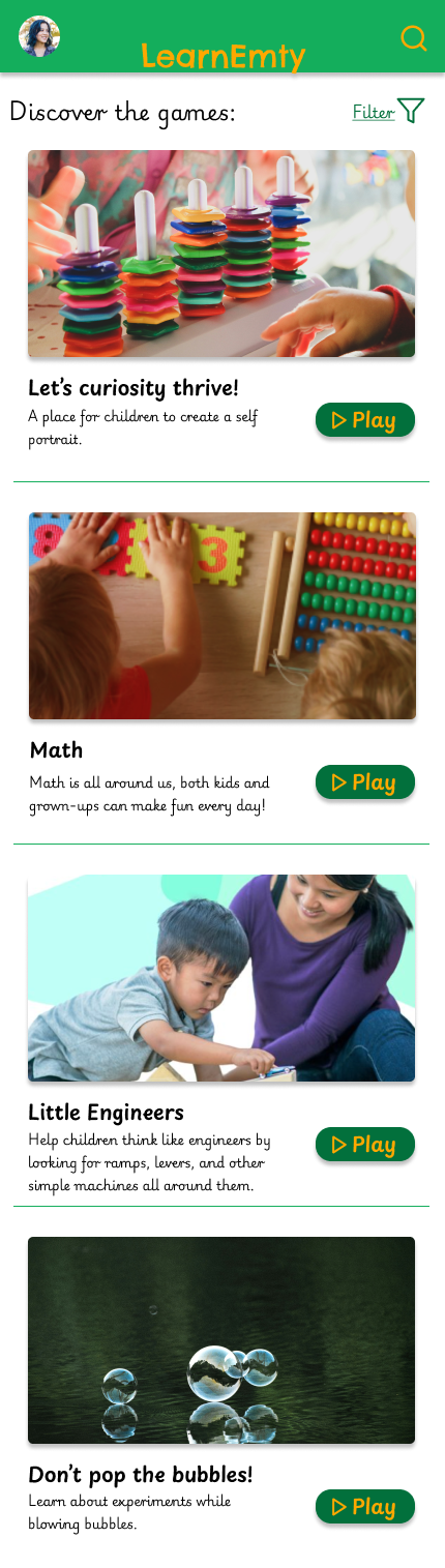
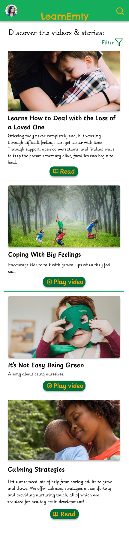
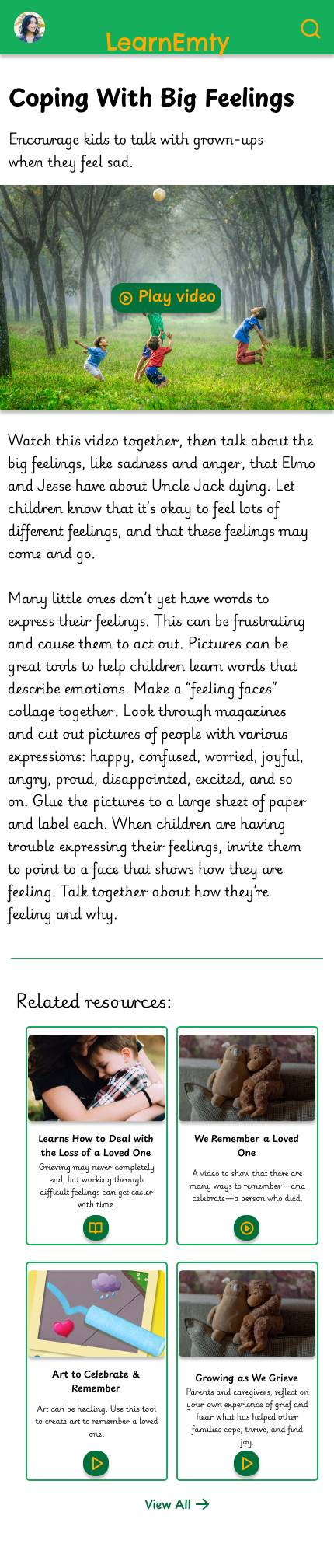
After ideating and drafting some paper wireframes, I created the initial designs for the LearnEmty app. These designs focused on access to games, videos and stories that may interest the kids.

Low-fidelity prototype

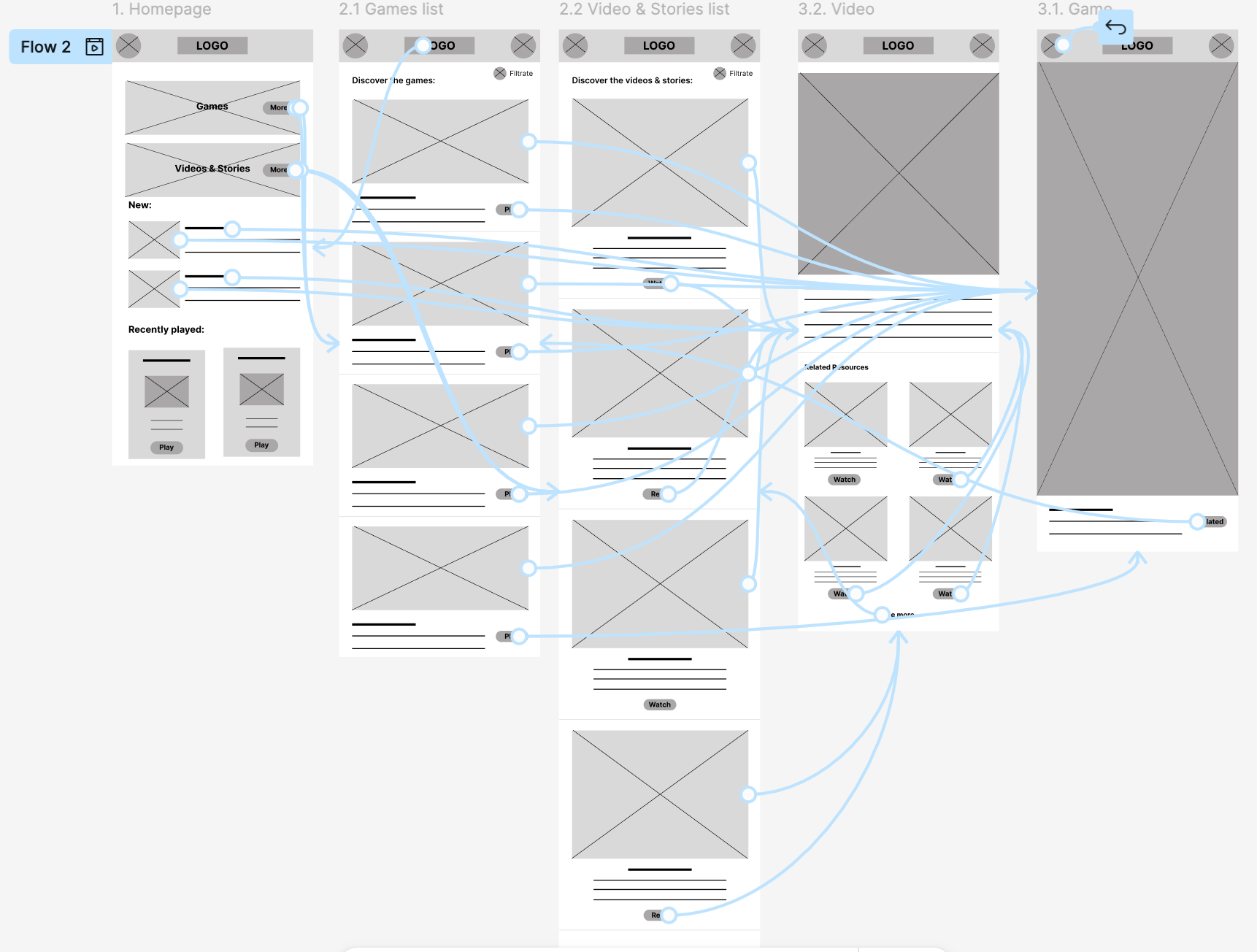
To prepare for usability testing, I created a low-fidelity prototype that connected the user flow of viewing a video or story of all the available content

View LearnEmty's low-fidelity prototype

Responsive designs

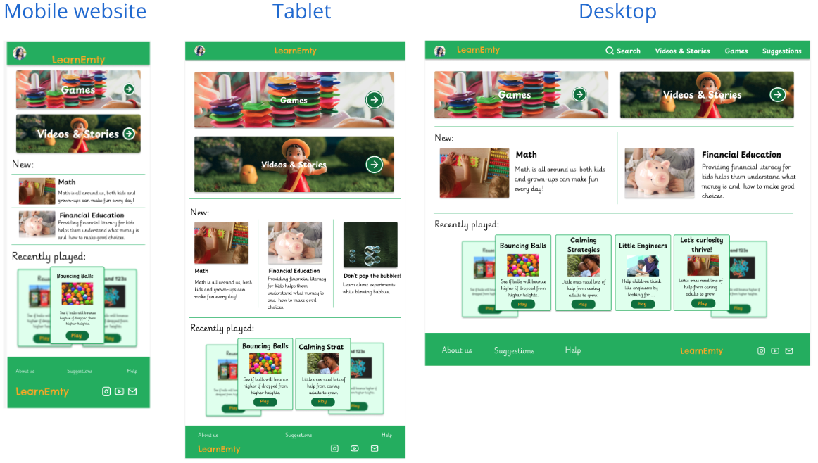
The designs for screen size variation included mobile, tablet, and desktop. I optimized the designs to fit specific user needs of each device and screen size.

Multiple website sizes of the same homepage.

Paper & Digital wireframes

First digital wireframes made
First digital wireframe made for the homepage
First paper wireframes made, and the final combination.
Screnshot of the low fidelity prototype, showcasinf the pages and how are they connected.
No items found.

MockUps

Screnshoot of the app homepage of the project.
Screnshoot of the app gamelist of the project.
Screnshoot of the app video list of the project.
Screnshoot of the app video reproduction of the project.
No items found.

Conclusion

Users shared that the app made their kids easier to say what they feel and manage their emotions. One quote from peer feedback was that “My kid was feeling frustrated with school homework and al by herself was able to calm and say to me what was she feeling.”I learned that even though the problem I was trying to solve was a big one, diligently going through each step of the design process and aligning with specific user needs helped me come up with solutions that were both feasible and useful.

"It's amazing for the kids, they lean a lot with it!"

by Daniel

Other projects

Let's work together!

As you can see in my portfolio with all my projects I’m passionate about creating intuitive, user-centered designs that solve real-world problems. Throughout my journey, I’ve honed my skills in user research, prototyping, and usability testing, using tools like Figma and Adobe XD. Feel free to explore and connect with me!

Thank you! Your submission has been received!
Oops! Something went wrong while submitting the form.