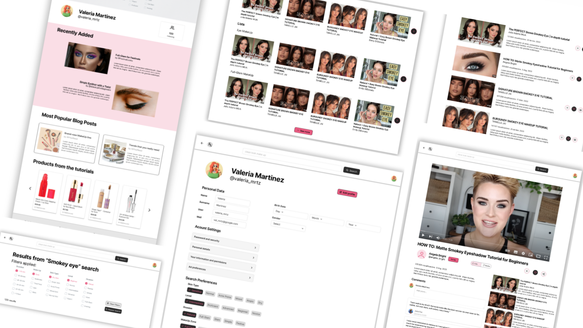
Brush & Shine is a website full of tutorials that offers all types of makeups. The typical user is between 15-45 years old, and most users are makeup enthusiasts. Brush & Shine goal is to make searching easy and fast for all types of users.
It’s difficult to find the video with the exact characteristics one wants, with applying filters can be confusing and making easy to connect with the community.
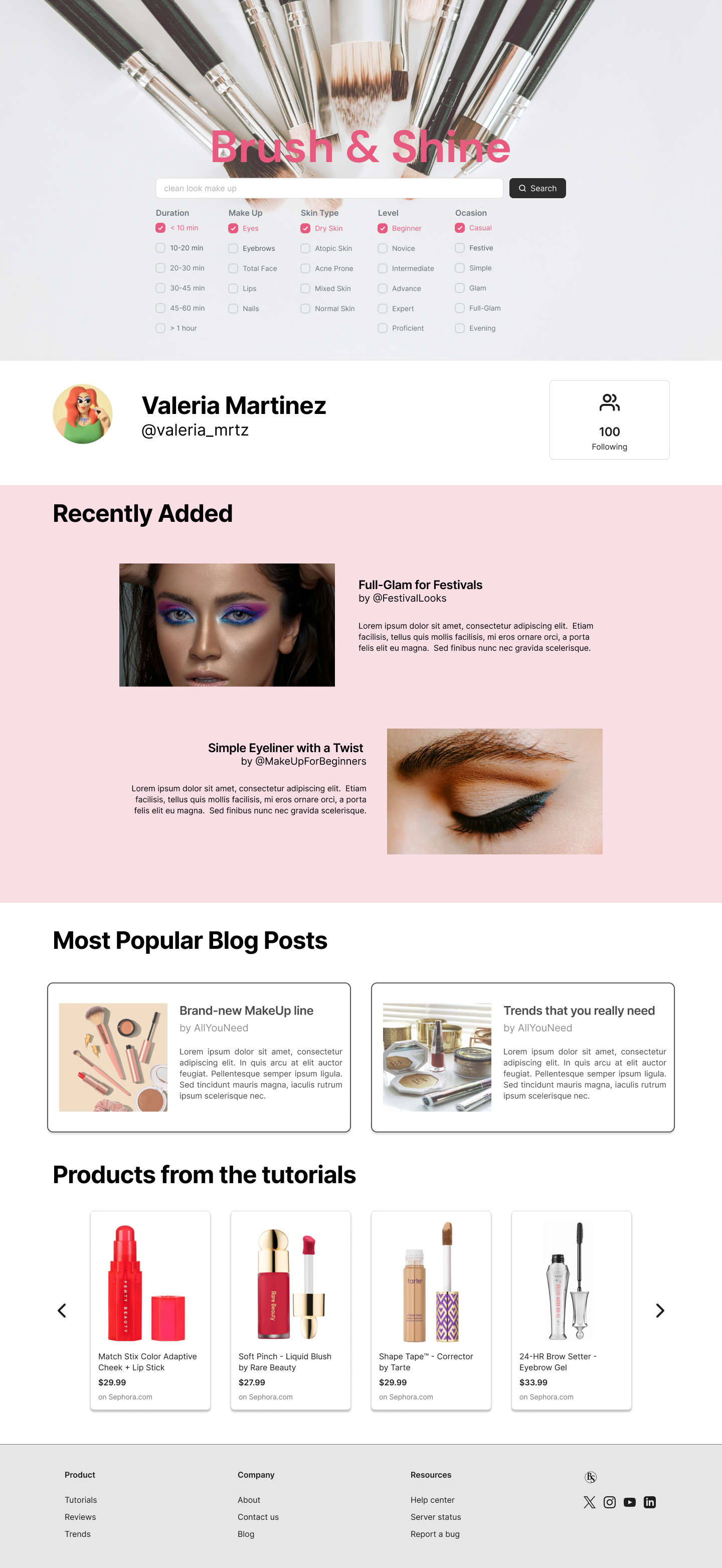
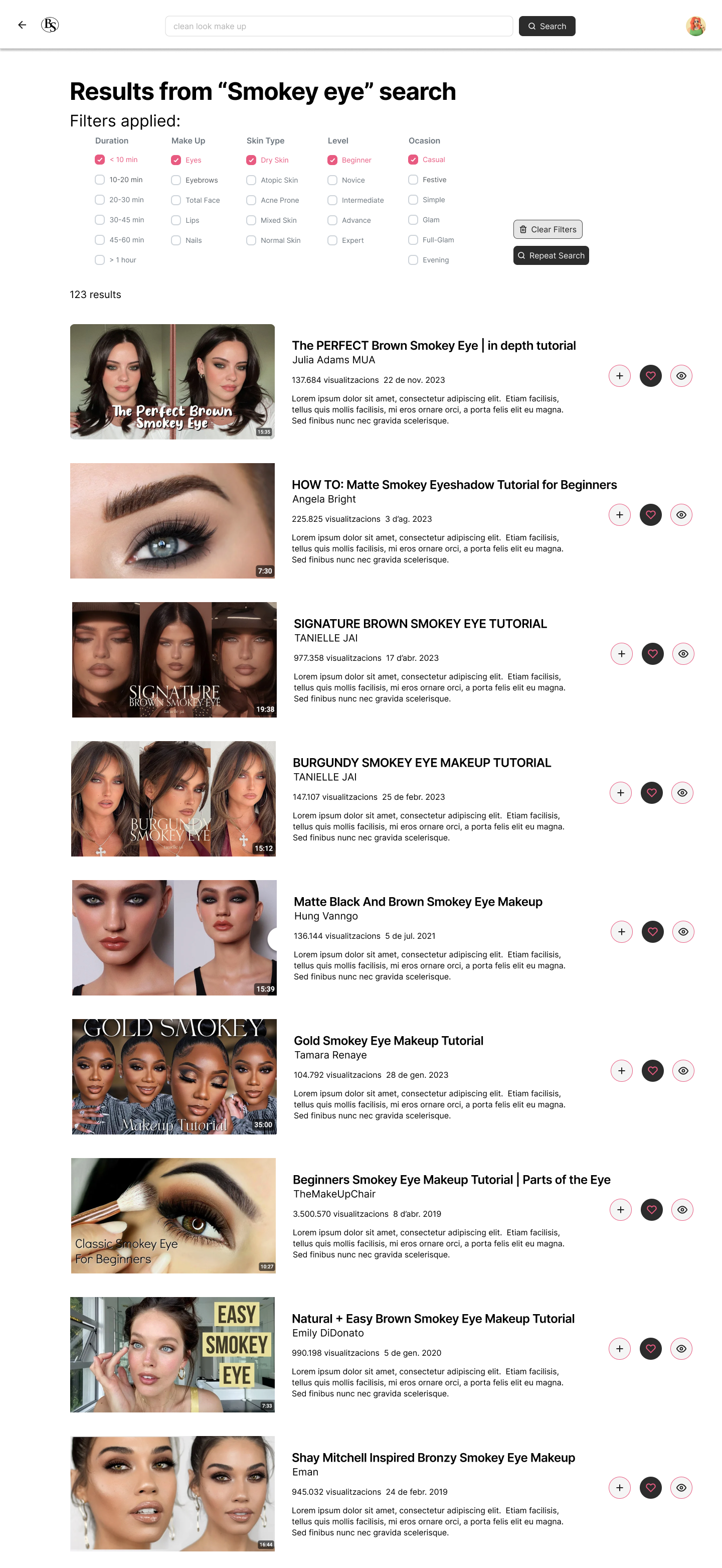
Design the Brush & Shine website to be user friendly by providing clear navigation and applying filters an easy process.

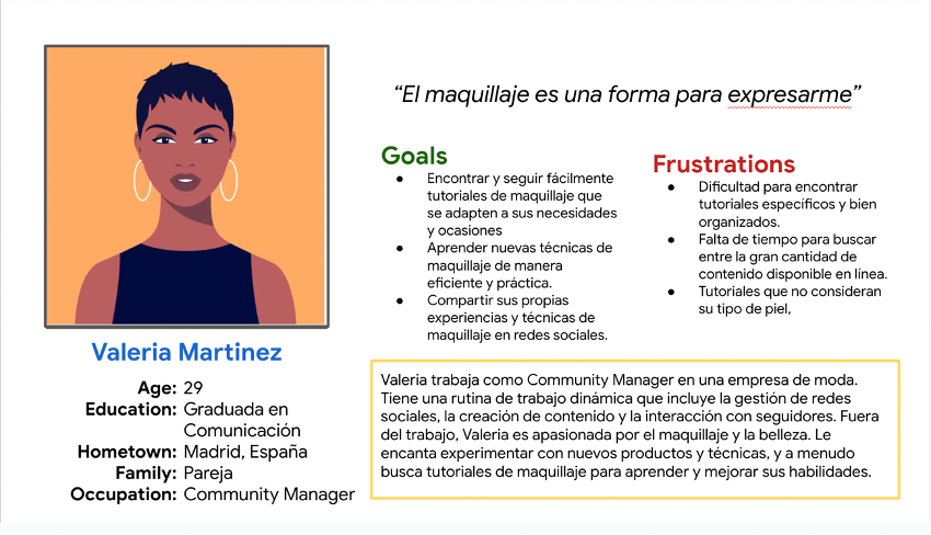
Valeria Martínez is a young makeup enthusiast who needs to find and view makeup tutorials specific to her skin type and special occasions because she wants to learn and apply makeup techniques that enhance her beauty for different events without wasting time searching through multiple sources.
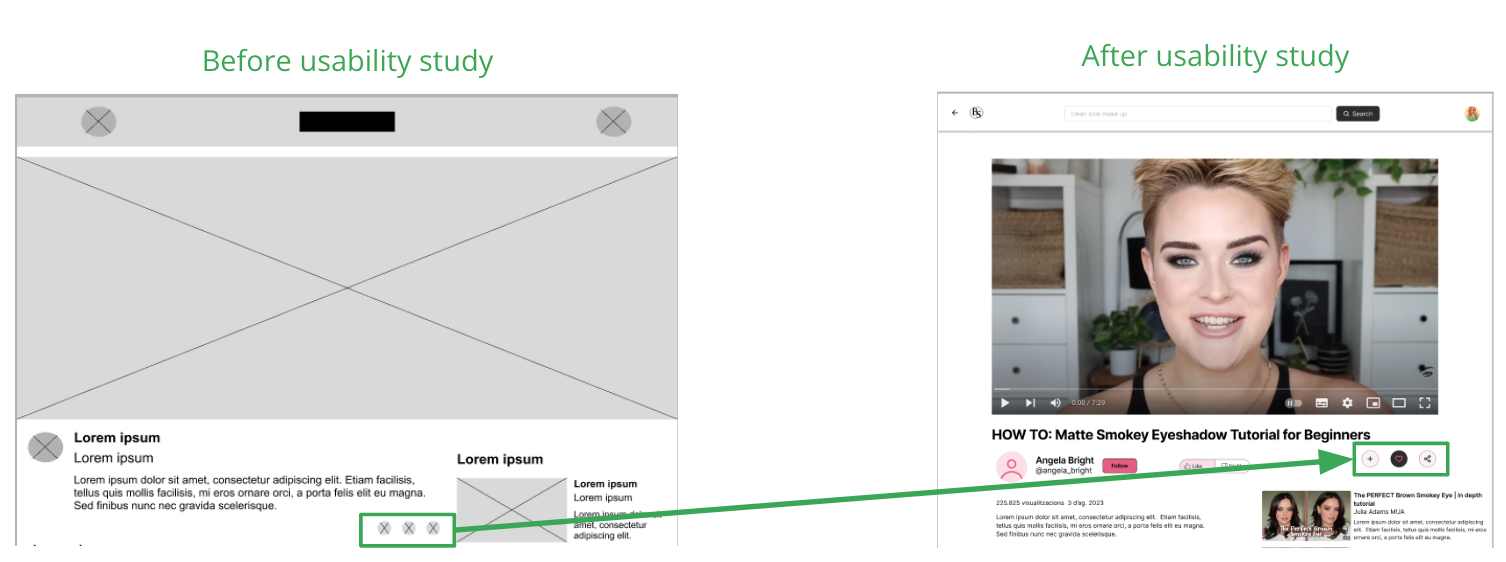
At this point, I had received feedback on my designs from members of my team about things like placement of buttons and page organization. I made sure to listen to their feedback, and I implemented several suggestions in places that addressed user pain points.
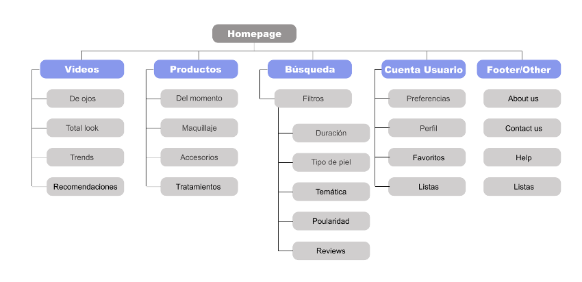
Difficulty with navigation through the tutorials was a primary pain point for users, so I used that knowledge to create a sitemap. The structure I chose was designed to make things simple and easy.
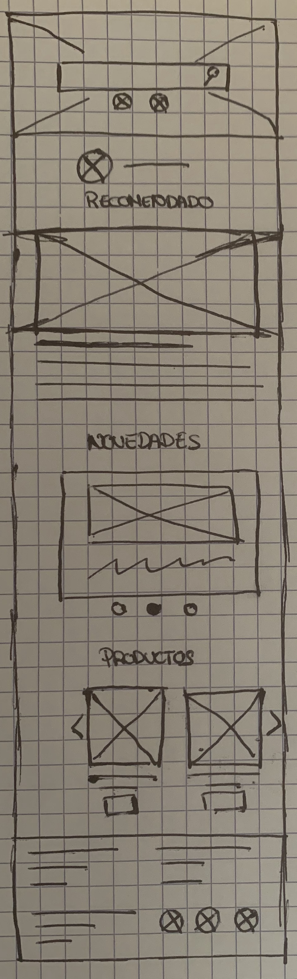
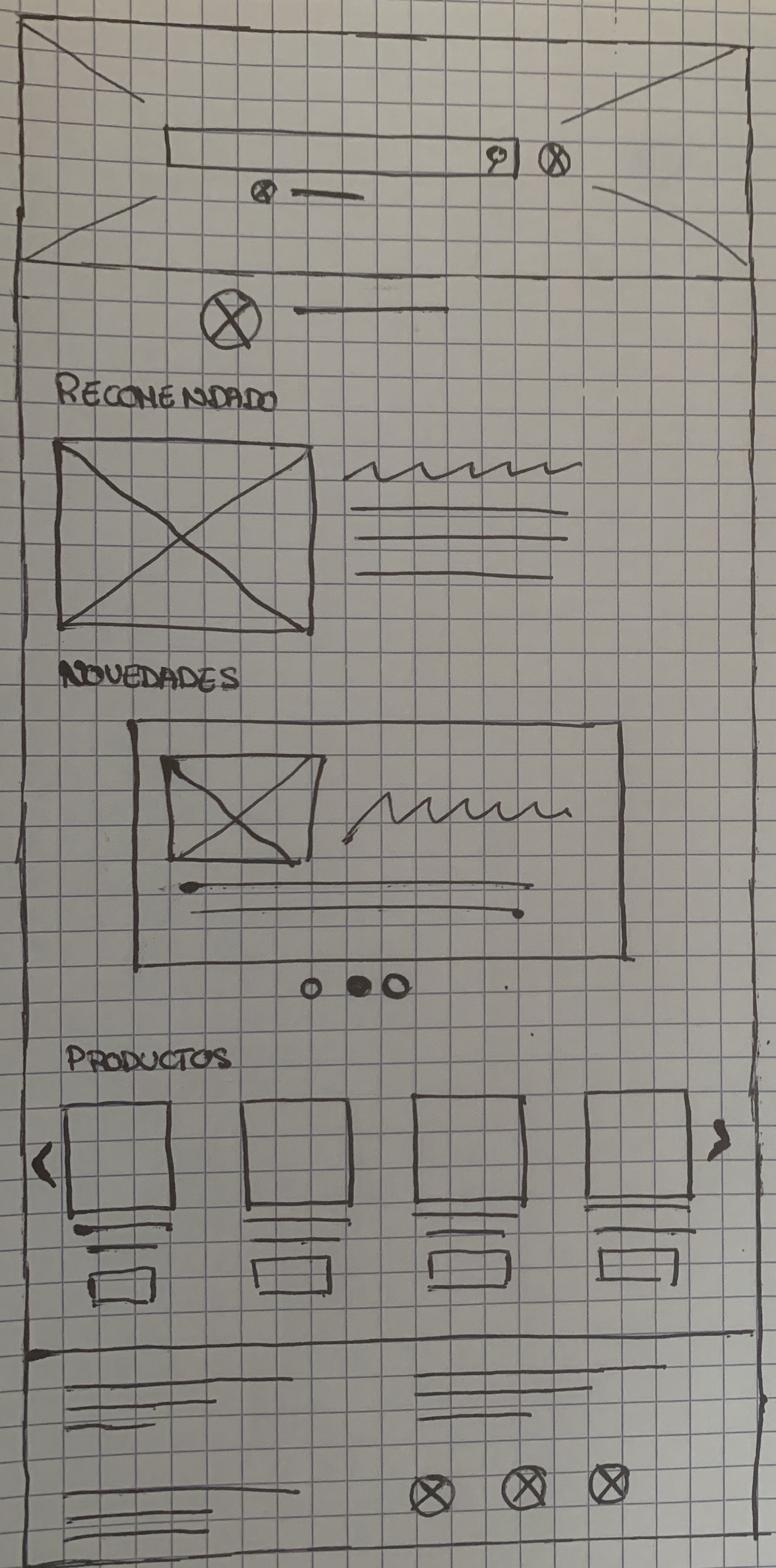
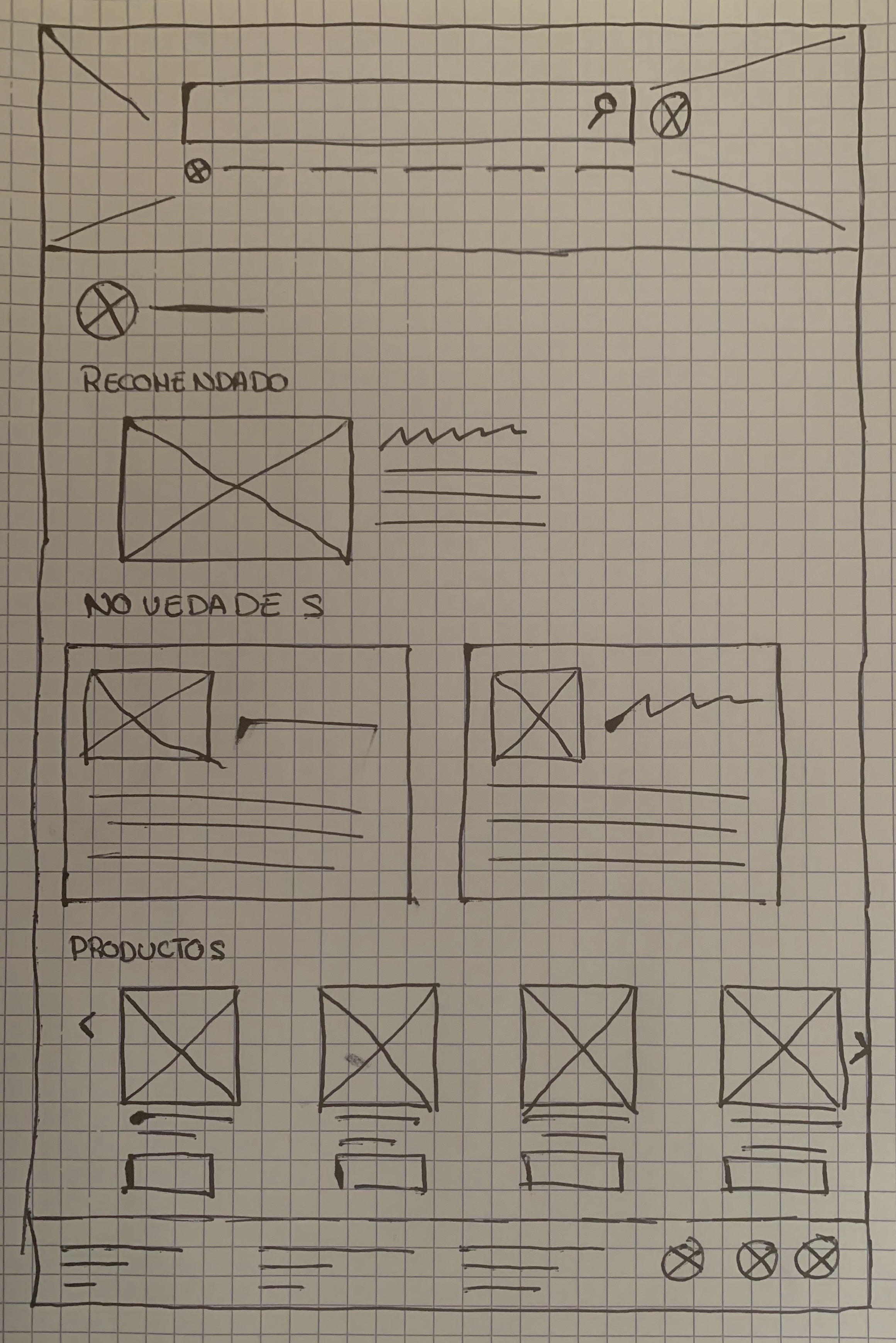
Next, I sketched out paper wireframes for each screen in my app, keeping the user pain points about navigation and searching process.
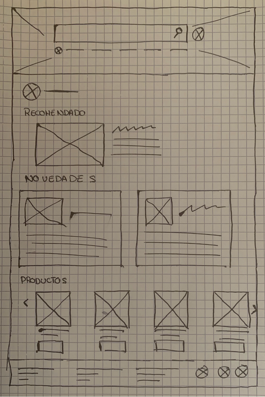
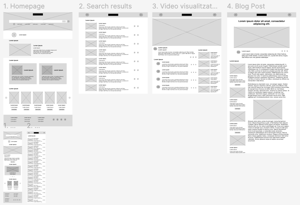
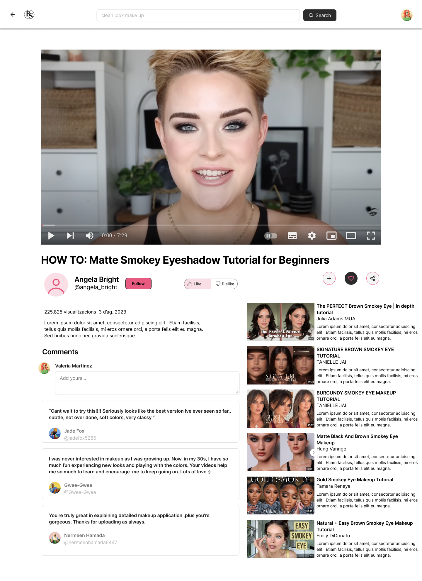
Moving from paper to digital wireframes made it easy to understand how the redesign could help address user pain points and improve the user experience. Prioritizing useful filtering process and visual element placement on the home page was a key part of my strategy. To create a low-fidelity prototype, I connected all of the screens involved in the primary user flow of doing a search and visualize a video.
"There's a lot of content for my I love it so much!"
As you can see in my portfolio with all my projects I’m passionate about creating intuitive, user-centered designs that solve real-world problems. Throughout my journey, I’ve honed my skills in user research, prototyping, and usability testing, using tools like Figma and Adobe XD. Feel free to explore and connect with me!