The CoffeeShop is a regional coffee maker located in the center of London, UK. It strives to offer a great variety of coffee, imported from around the world. They also offer a some great healthy food options with great prices.
The users usually have to wait for their order to be ready when usually they are in a hurry to get to work, school, etc.
Design an app for CoffeeShop thaht allows users to easily order what they want and pick it up in their way.

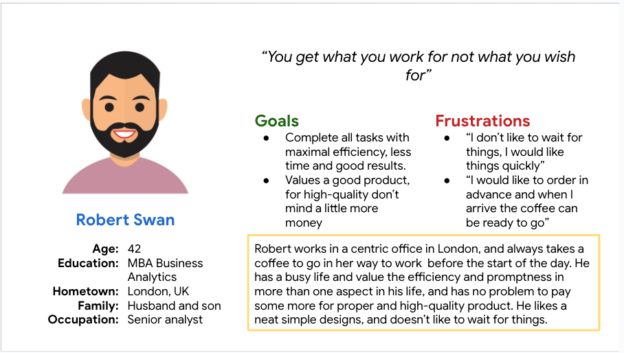
Robert is a middle aged businessman who works in business who needs efficiency in the process of making his coffee order because he needs to get to work quickly.
The first usability study we interviewed 5 users with the prototype, we took notes on how each user interacted and what can be modified to make it better.
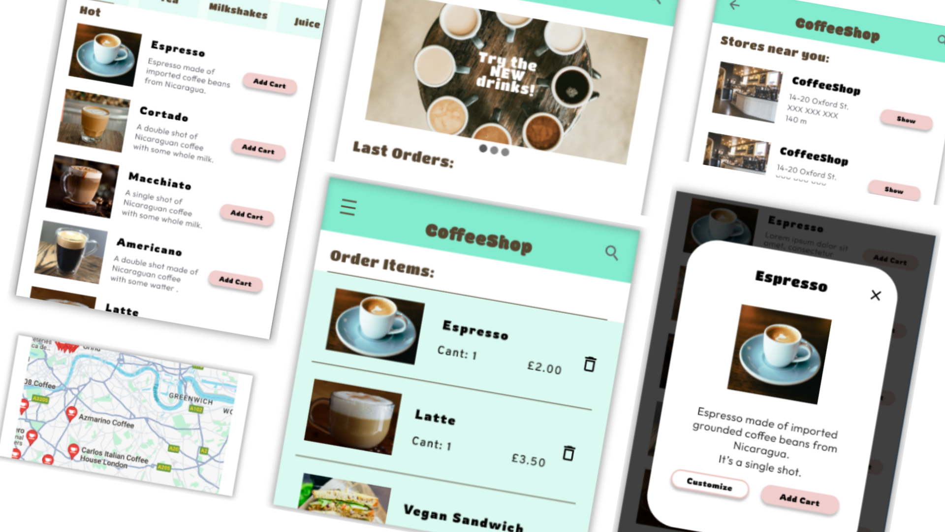
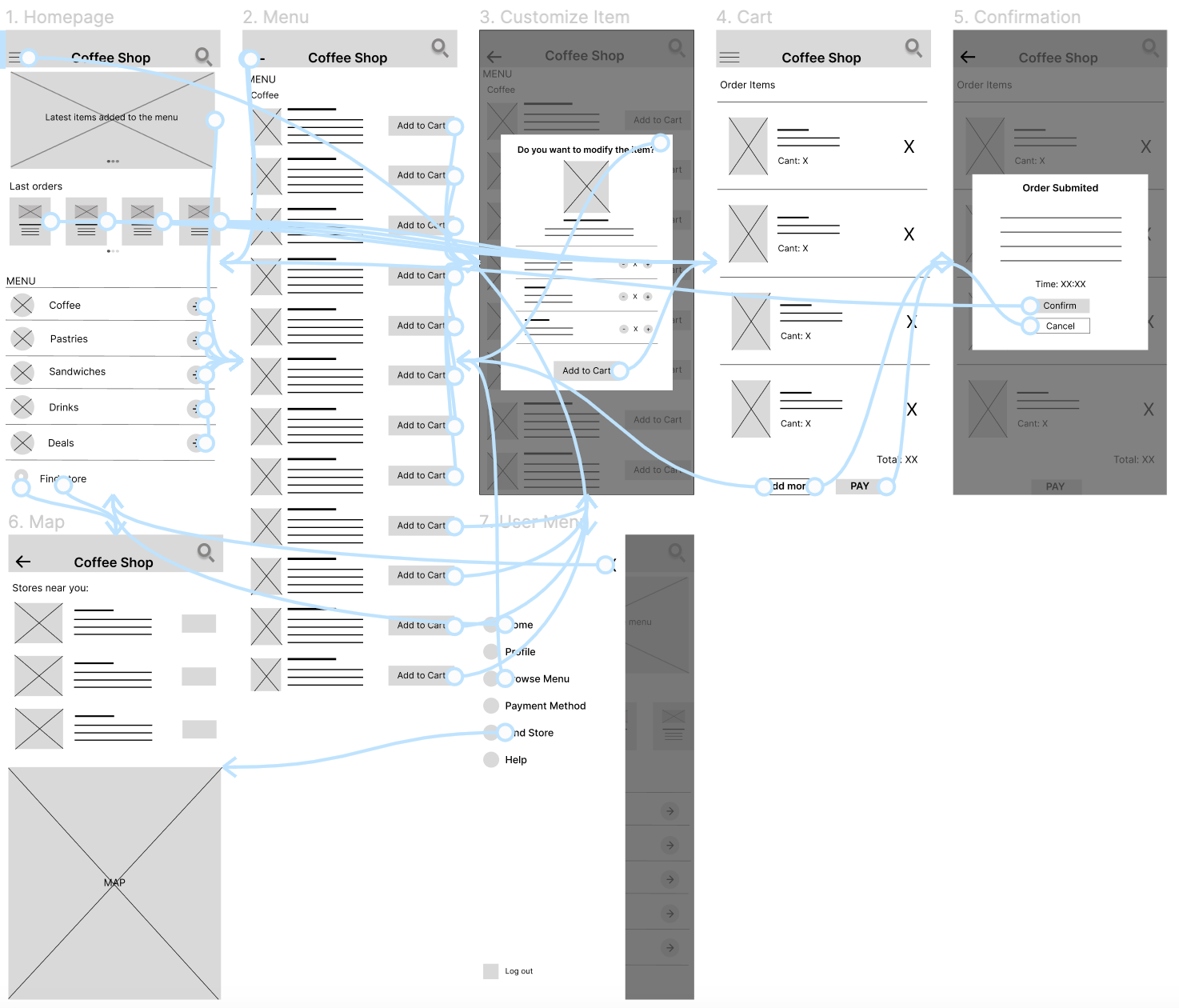
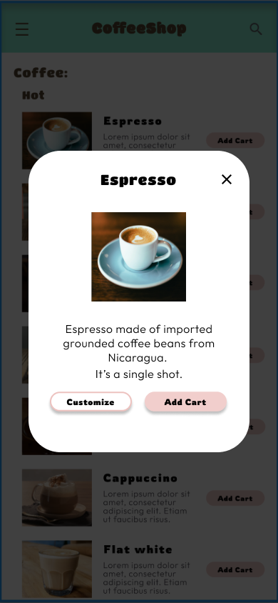
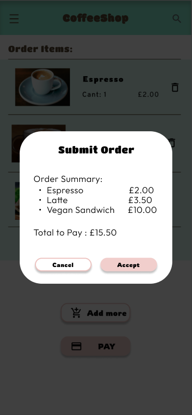
Initially we thought that the customization page follows to the button tap to add cart, but after the usability studies, we decided to separate the process in to pages for a better user flow and make the process of customization easier.

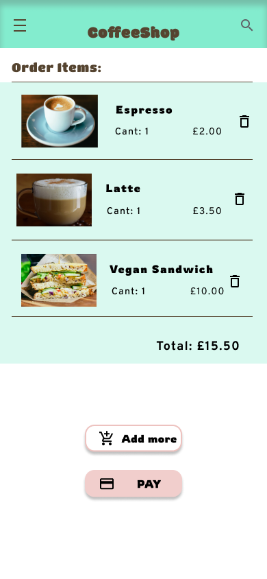
The second usability study revealed frustration with the searching flow. to streamline this flow, I added tabs to move through the different pages of the menu and visit the shopping cart to make the flow easier in every step.

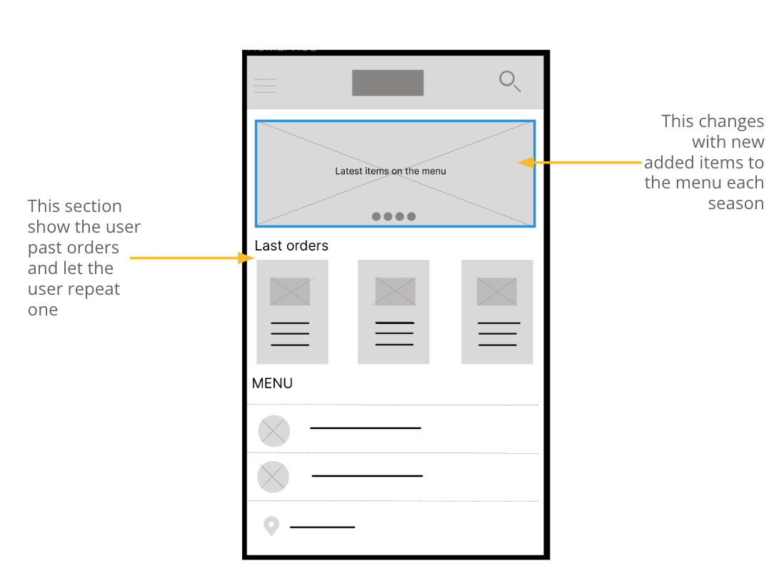
Taking the time to draft iterations of each screen of the app ensured that the elements that made it to digital wireframes would be well-suited to address user pain points. For the home screen, I prioritize a quick and easy ordering process to help users save time
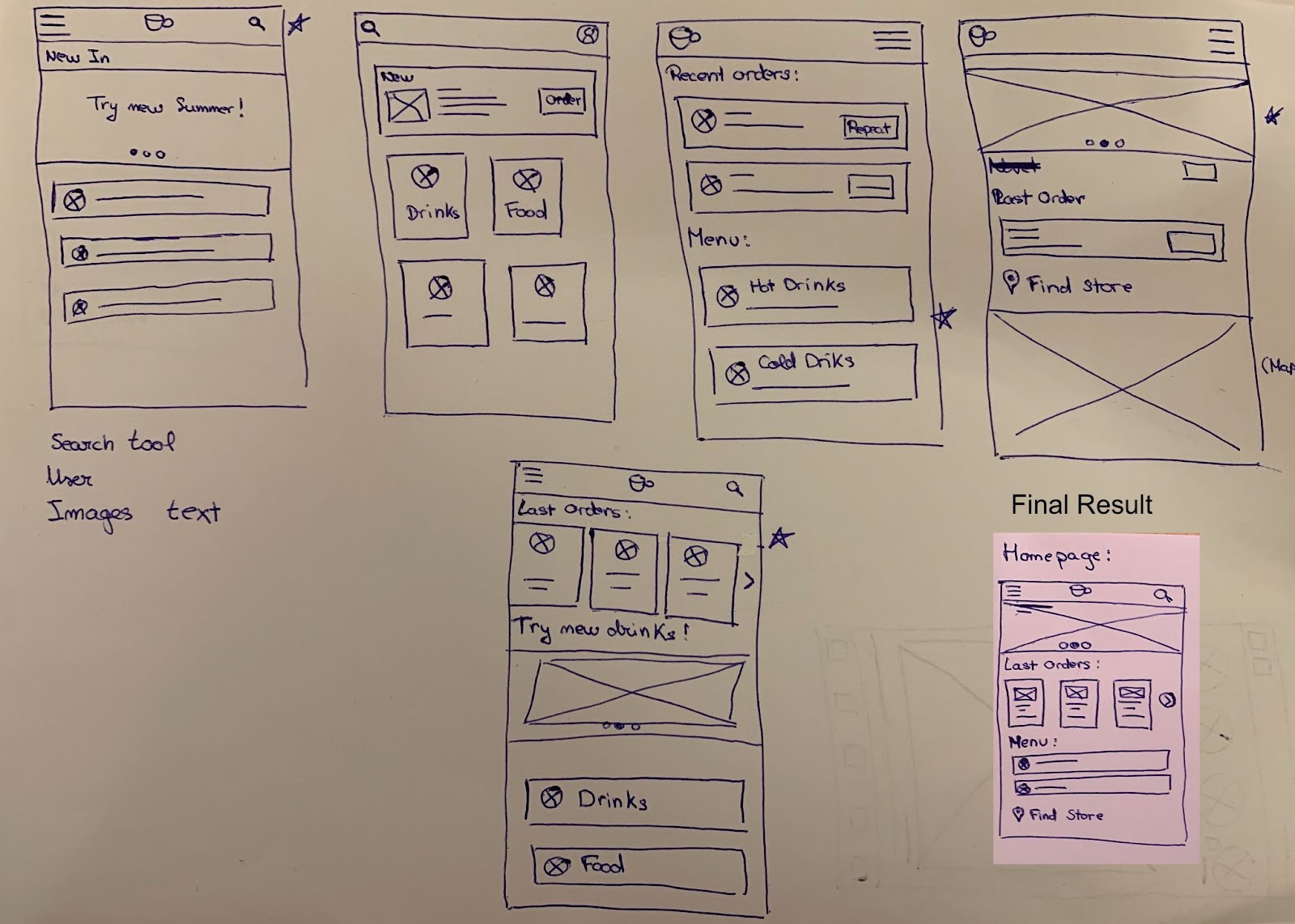
- As the initial design phase continued, I made sure to base screen designs on feedback and findings from the user research.
- We wanted the user to search and made the order in the shop near them and this way is the most easy way to find it.
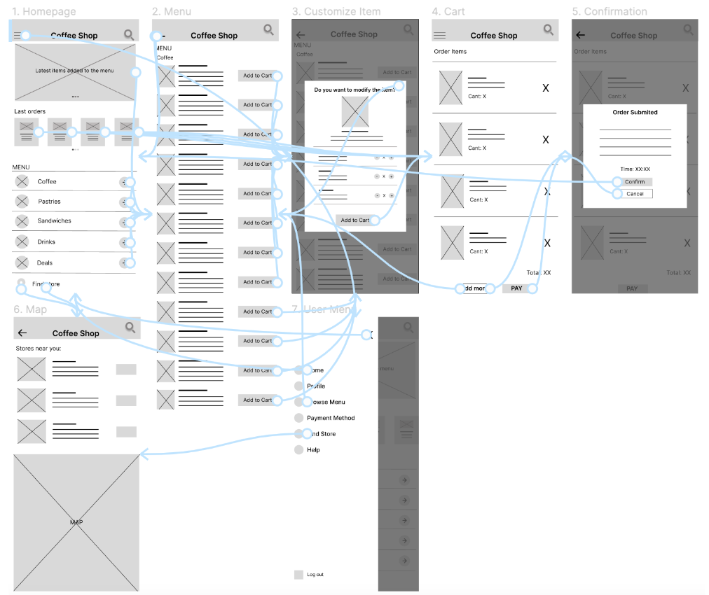
Low fidelity prototype connected the primary user flow of browsing the menus and placing an order in the coffee shop, so the prototype could be used in a usability study with users.
View the CoffeeShop: Low-fidelity prototype
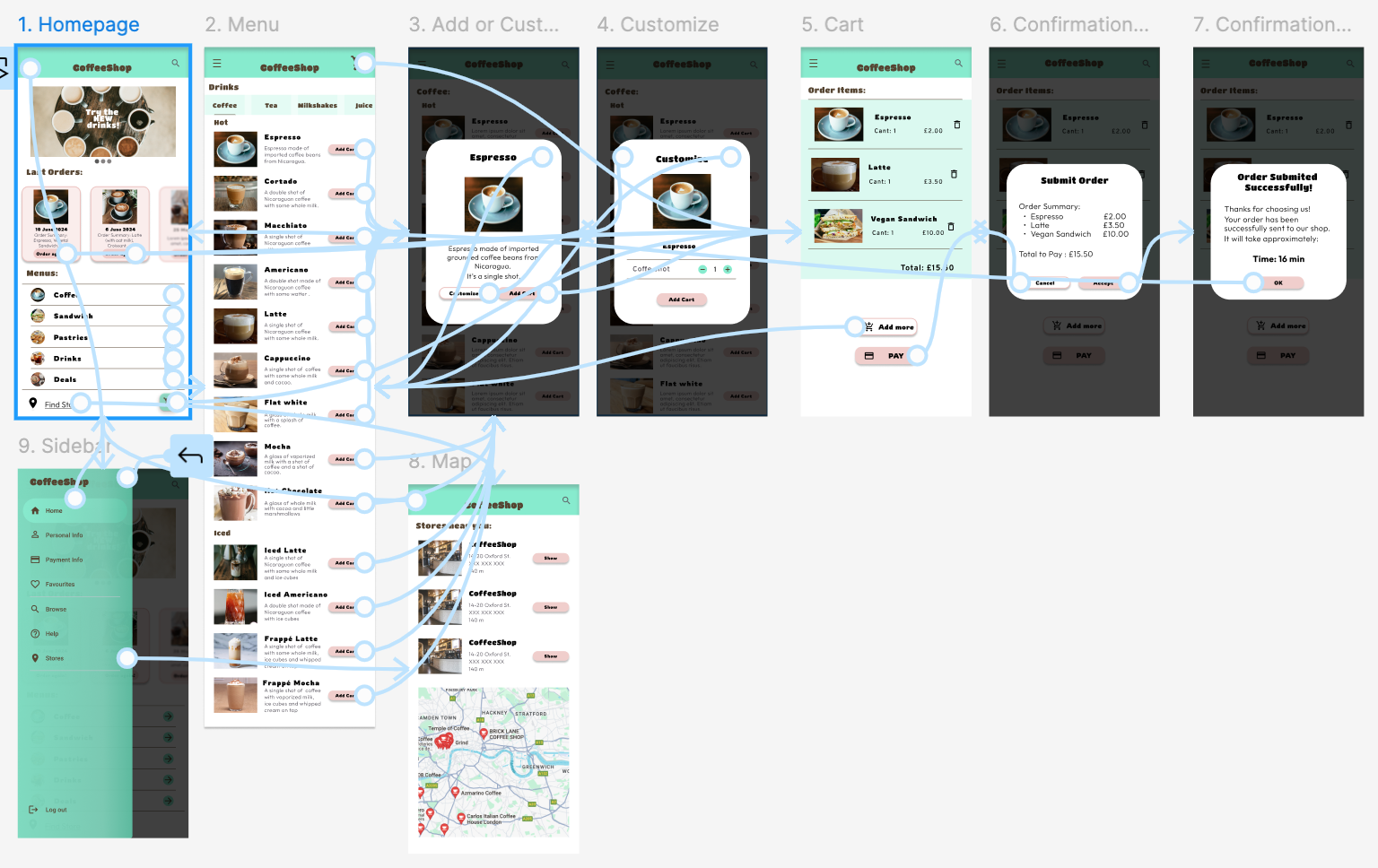
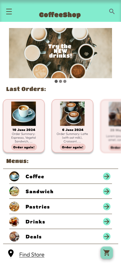
The final high-fidelity prototype presented cleaner user flows for making a coffee order. It also met user for an easier customization.


"I tried to use it and is so easy to use, I think it's a great solution for making your order"
As you can see in my portfolio with all my projects I’m passionate about creating intuitive, user-centered designs that solve real-world problems. Throughout my journey, I’ve honed my skills in user research, prototyping, and usability testing, using tools like Figma and Adobe XD. Feel free to explore and connect with me!